
Scaling a Complex SaaS Reskin with AI-Assisted Design Systems
ThriveCart, Responsive UX, Component Systems, Implementation, and Release Quality
In short
- Problem
- ThriveCart's platform had grown over years into a dated, inconsistent interface. It needed redesigning and modernising across the product without breaking the workflows merchants rely on every day.
- My role
- Product designer. I owned the component and design-system audit approach, which I ran with AI agents, plus mobile guidance, implementation review and release follow-up.
- Key decision
- Treat the reskin as a system problem rather than a screen problem, and validate against live accounts rather than outdated references.
- Outcome
- Related design work shipped publicly or to Alpha across multiple product areas, with further system and responsive work prepared for delivery.
- Role
- Product/UI/UX Designer
- Scope
- Product reskin, design systems, responsive design, implementation review, design QA, and design-to-development collaboration.
- Collaboration
- Product, engineering, QA, design, and cross-functional stakeholders.
- Status
- Related design work shipped publicly or to Alpha across multiple product areas, with additional system, responsive, and implementation work prepared for delivery.
- AI leverage
- UI audits, mobile design exploration, component analysis, documentation, and design-release visibility.
- Verified AI evidence
- In one mobile design task, AI generated approximately 60% of the initial design direction, which was refined and turned into useful mobile guidance in approximately 2 to 3 hours.
Opening Summary
ThriveCart is a checkout and selling platform used by 75,000+ solopreneurs, coursemakers and community builders, with more than $8B processed through its checkouts (ThriveCart's published figures). Over the years the platform had grown into a complex product with many workflows, product areas and account types, and an interface that looked and behaved differently from one area to the next.
The brief was to redesign the old platform and modernise it: a new, consistent interface across the product, delivered without disrupting the merchants who run their businesses on it.
During the work, I recognised that modernising the interface was only half the problem. The product also needed a clearer connection between Figma, Storybook, the UI package, the live product, responsive behaviour and engineering implementation, or the new design would drift as fast as it shipped.
I helped turn the redesign into a broader design and delivery system that improved product consistency, increased mobile coverage, and gave engineering clearer guidance.
The job was to redesign and modernise an old platform. The harder design problem was doing it in a way that could be implemented, reviewed and kept consistent across a complex, live product.
AI as a Design Multiplier
I used AI as a force multiplier across the design process.
I used AI agents to audit the existing implementation against Storybook and identify possible gaps between the implementation and the intended component system.
I also used Figma agents to create an initial mobile design direction. In one mobile design task, the first pass completed approximately 60% of the work and allowed me to produce useful mobile guidance in roughly two to three hours.
AI accelerated the first pass, but I reviewed and refined the output manually. I did not treat AI-generated recommendations as final design decisions.
The workflow
- 01Existing product and design references
- 02AI-assisted audit or exploration
- 03Human validation and product reasoning
- 04Refined design and documentation
- 05Engineering implementation and QA
- AI accelerated
- Auditing.
- Mobile exploration.
- Repetitive analysis.
- Documentation.
- Design coverage.
- Release visibility.
- Human ownership
- Problem framing.
- Product decisions.
- Prioritisation.
- Quality control.
- Protecting existing functionality.
- Final design direction.
- Tradeoff decisions.
The value was not simply generating more screens. The value was increasing the amount of thoughtful, validated design work I could complete within the available time.
The Challenge
ThriveCart's interface had been built up over many years. It looked dated, and different areas used different visual and interaction patterns, so the platform needed a full redesign to modernise it.
Modernising a live product of this size raised its own challenges:
- Existing product surfaces did not always follow the same design language.
- Figma, Storybook, the UI package, and the live implementation were not always aligned.
- Developers sometimes had to interpret mobile behaviour from desktop designs.
- Reference accounts could be outdated and lead to inaccurate design decisions.
- New requirements had to fit existing transaction and account workflows.
- Design feedback needed to continue beyond the Figma handoff and into implementation.
The challenge was therefore not simply to make ThriveCart look newer. It was to modernise a complex product while creating a clearer, more scalable way for design and engineering to work together.
The question this turned on
How do we modernise a complex product while creating a clearer, more scalable way for design and engineering to work together?
The Old Platform
Before the redesign, each area of ThriveCart had grown its own look. Transactions used stacked stat blocks and bright blue buttons, the affiliate area had a separate style again, and reporting had its own top navigation (shown in Before and After below). Filters, buttons and type sizes changed from page to page.
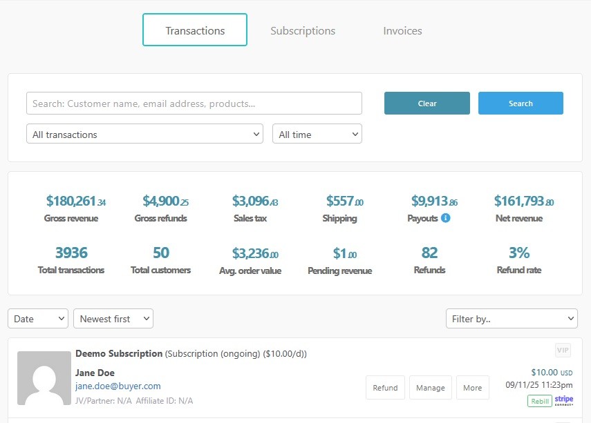
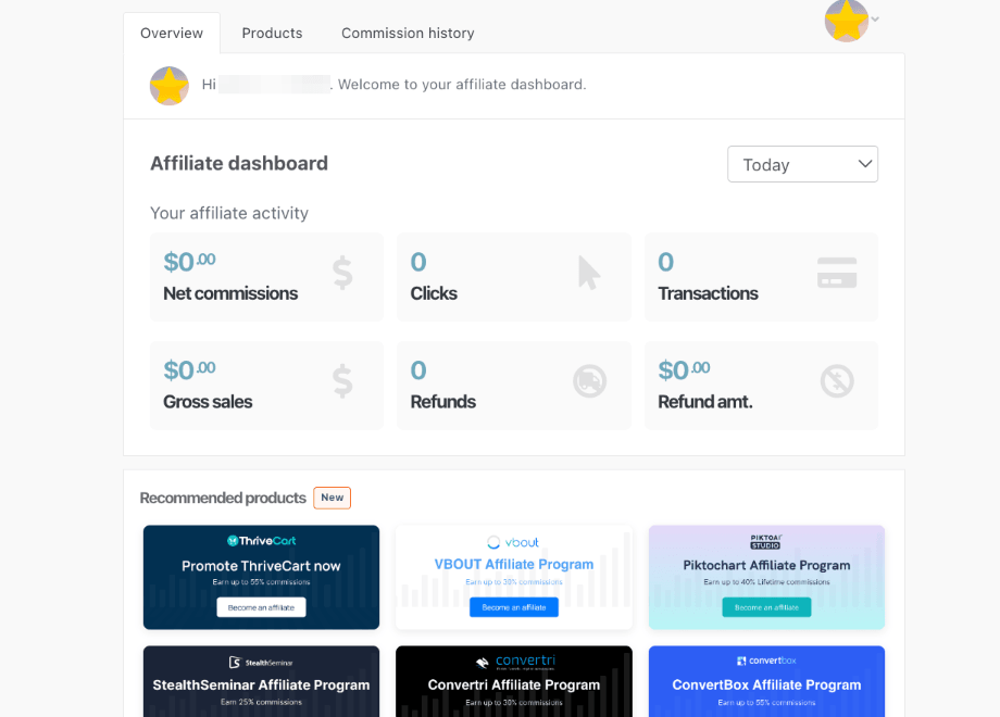
Screenshots of the old interface, from ThriveCart's public help centre.
My direct ownership
What I Owned
I identified that the reskin was being slowed down by inconsistent references between Figma, Storybook, the UI package, and the live product.
I took ownership of improving that connection through component mapping, AI-assisted auditing, responsive design guidance, implementation review, and release follow-up.
My direct contributions included:
- Defining the component and design-system audit approach.
- Creating linked Figma references for engineering.
- Producing mobile design guidance.
- Validating designs against real account states.
- Reviewing sandbox and staging implementations.
- Identifying design inconsistencies before release.
- Creating better visibility into design-related releases.
- Updating selected transaction and e-invoicing experiences.
- Cross-functional collaboration
- Product, on prioritisation and requirements.
- Engineering, on implementation and release work.
- QA, on validation across environments.
- Other designers, on the wider reskin.
- What this means
- I did not independently own every screen or release.
- The system, audit and responsive guidance above were mine to drive.
- Delivery across the product was a shared effort.
Key Decisions
01 Treat the reskin as a system problem
I created linked component inventories and implementation references so engineers could identify the intended Figma component, the affected interface, and the required implementation work.
This moved the work from isolated screen design toward reusable system decisions.
02 Validate the live product
In the affiliate flow, I discovered that the reference account did not reflect the current live product.
I gained access to a live account and redesigned the flow based on the actual experience rather than outdated assumptions.
03 Make mobile design part of the design responsibility
Developers were sometimes expected to interpret responsive behaviour from desktop designs.
I used AI-assisted design workflows to create mobile guidance quickly, then refined the output manually so the final direction reflected the actual product experience.
04 Stay close to implementation
I reviewed sandbox and staging implementations, checked responsive behaviour, identified inconsistencies, and provided focused feedback to engineering.
This allowed design issues to be identified during implementation rather than only after release.
Tradeoffs
What I chose not to do
The goal was not to replace every existing pattern immediately. We needed to modernise the product while protecting existing functionality and working within engineering capacity.
I therefore prioritised:
- Reusable components over one-off visual fixes.
- Mobile guidance for high-value product surfaces.
- Real product validation over assumptions from outdated accounts.
- AI-assisted exploration followed by human review.
- Implementation-ready improvements over speculative redesign.
- Consistency where it improved usability, while preserving necessary product-specific behaviour.
How the component audit ran
- 01Figma reference
- 02Storybook and UI package comparison
- 03AI-assisted audit
- 04Human validation
- 05Engineering-ready component guidance
Before and After
Products and Sales, one of the most-used reporting surfaces, before and after the redesign.
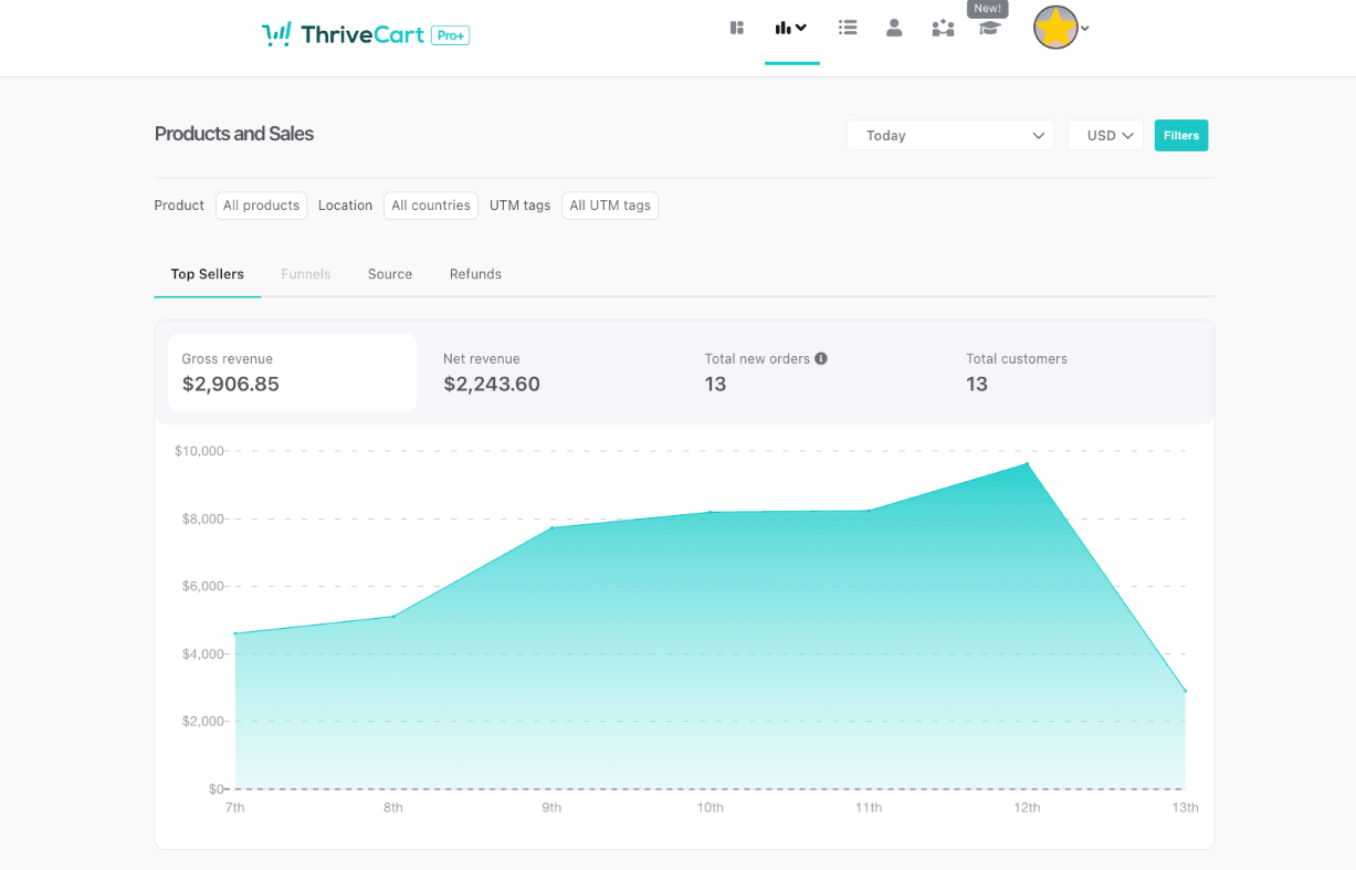
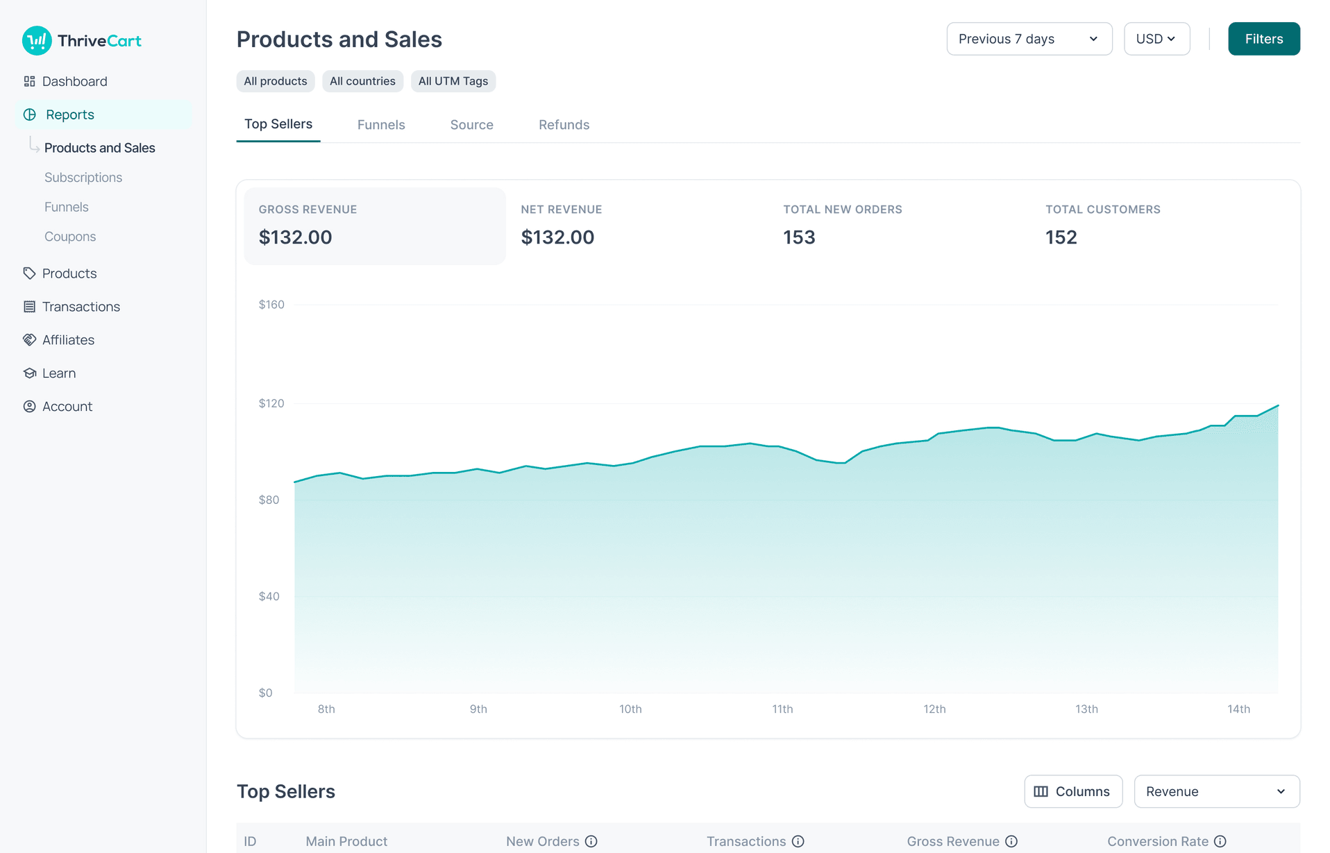
The before screenshot is from ThriveCart's public help centre.
Visual Evidence
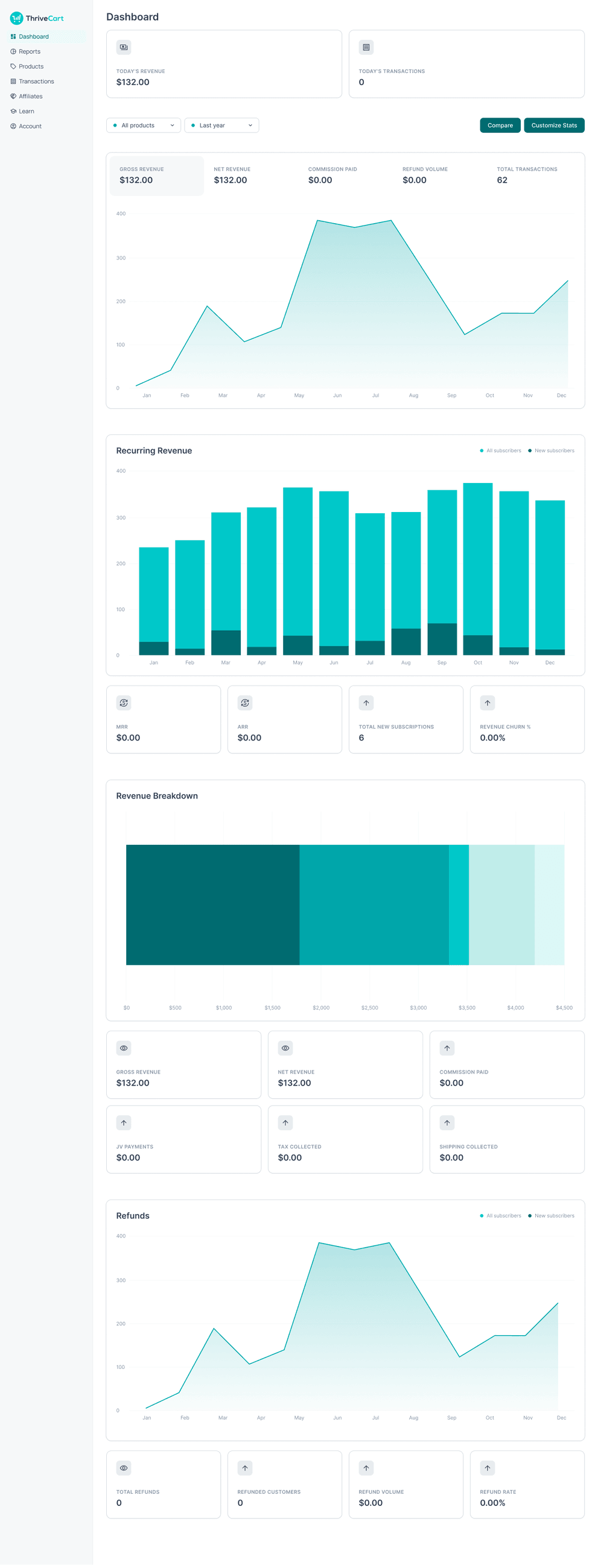
Dashboard overview and financial charts
Implementation-ready- Problem
- The dashboard needed a clearer hierarchy for merchants reviewing revenue, account health, and recent activity.
- Decision
- I prioritised a more structured layout, stronger information hierarchy, and clearer chart presentation to improve at-a-glance understanding.
- Contribution
- Owned the design direction for this surface.
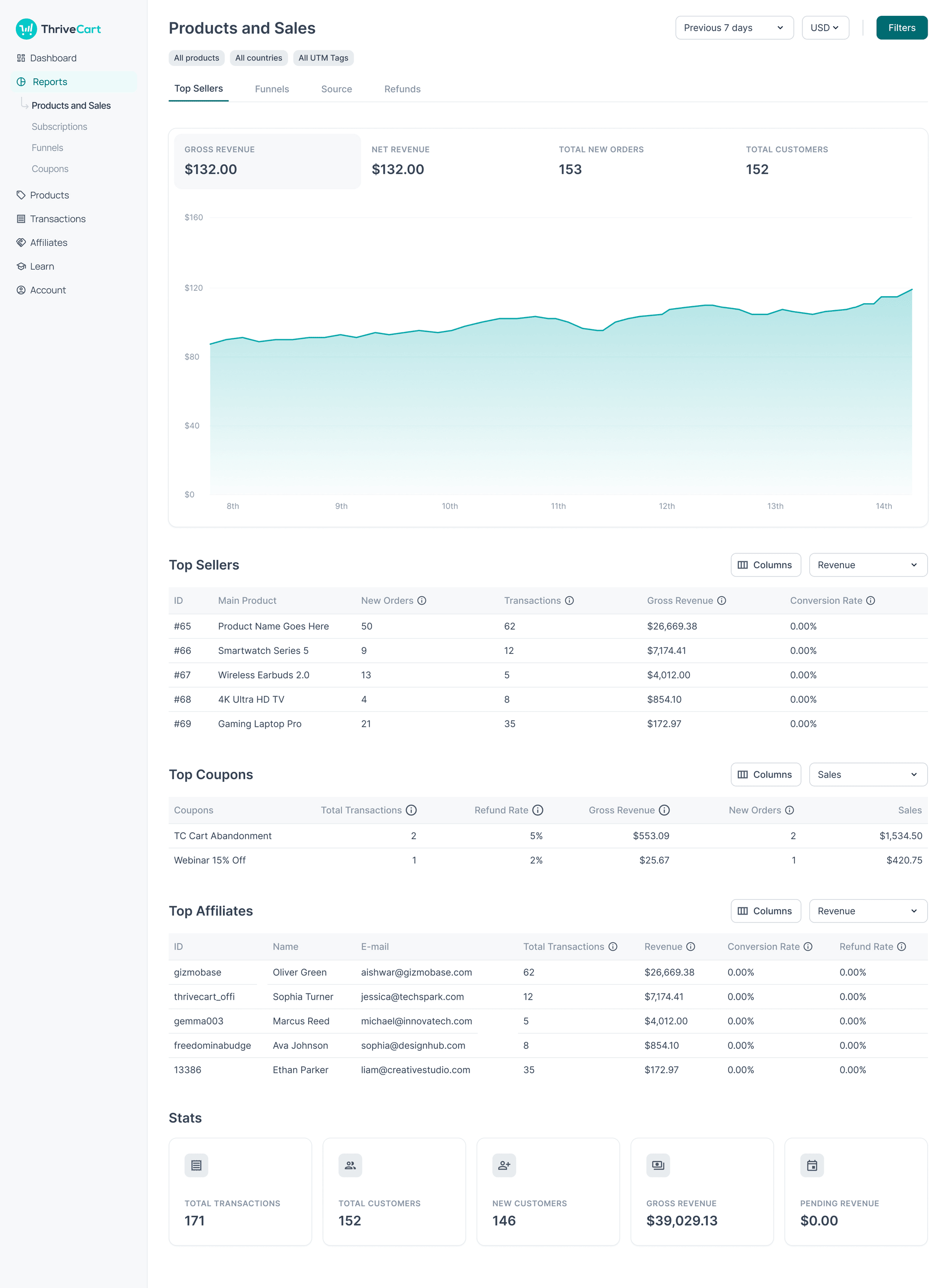
Financial reporting and transaction metrics
Implementation-ready- Problem
- Reporting surfaces needed stronger visual hierarchy and clearer interaction patterns to support merchant analysis.
- Decision
- I introduced more consistent filtering, clearer chart states, and improved information density to make reporting easier to scan and act on.
- Contribution
- Owned the design direction for this surface.
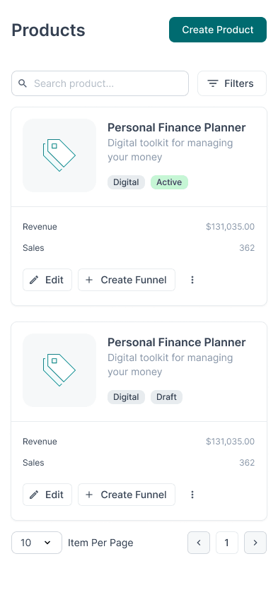
Handheld viewport layouts for mobile merchants
In implementation- Problem
- Mobile merchants needed a more predictable and finger-friendly experience across core account and transaction surfaces.
- Decision
- I created mobile guidance early in the process so responsive behaviour was treated as a first-class design requirement rather than an afterthought.
- Contribution
- Owned the mobile guidance; engineering owned the build.
Implementation-ready
Component and design-system audit
- Problem
- Figma, Storybook and the UI package were not always aligned, and the gaps were invisible until implementation.
- Recommendation
- Audit the implementation against Storybook and map each component to its intended Figma source.
- Contribution
- Owned the audit approach.
In implementation
Desktop and mobile view of the same flow
- Problem
- Responsive intent is hard to judge from a desktop screen alone.
- Recommendation
- Show one flow at both widths so the responsive decisions are legible.
- Contribution
- Owned the responsive guidance.
Shipped
Design-to-development review
- Problem
- Design feedback needed to continue past handoff and into the build.
- Recommendation
- Review sandbox and staging implementations and feed specific issues back to engineering.
- Contribution
- Owned the design review; partnered with QA.
Delivery Evidence
Related design work shipped publicly or to Alpha across multiple product areas, including Account Selection, Profile, Transactions, Reporting, Customer Hub, and mobile product surfaces.
Additional component, responsive, and implementation work was prepared for delivery and release review.
Related design work was supported or reviewed across these areas. I did not independently design every area.
Verified Impact
Product impact
The product moved toward a more consistent, modern, and scalable interface across multiple product areas.
User impact
Users received clearer workflows, improved visual hierarchy, stronger responsive behaviour, and more predictable interaction patterns.
Team impact
Engineering received linked component references, mobile guidance, design annotations, and more actionable implementation requirements.
Process impact
AI-assisted auditing and design workflows made it possible to cover more screens, states, and implementation details without reducing the level of human review.
Delivery evidence
Related design work reached public release or Alpha across multiple product areas. I also stayed involved through sandbox, staging, and release review so that design issues could be identified during implementation.
Senior Designer Takeaway
I can understand a complex SaaS product, identify systemic design problems, establish design-system direction, use AI to increase design velocity and coverage, improve responsive quality, collaborate closely with engineering, create processes that help the wider team work more effectively, and follow design through implementation and release.
My value is not only in creating polished interfaces. I help teams understand complex problems, make better product decisions, move faster with AI, and deliver experiences that are clearer, more consistent, and more useful.
I use AI to increase the amount of thoughtful, validated design work a team can deliver, not to replace design judgment.
Related work
Selected work
Designing Trust into AI-Connected Commerce
Research and prototype work for ThriveCart MCP, focused on onboarding, permissions, privacy, trust, and AI product value.
Read case studySelected work
From Visual Rebrand to AI-Ready Product Strategy
Taking StealthSeminar to ThriveSeminar: a phased reskin, research-led UX redesign, and groundwork for AI-assisted setup.
Read case study