
Shaping an Accessible MVP for Public-Sector Data
National Data Library, formerly data.gov.uk: discovering and using public-sector data
In short
- Problem
- The legacy data.gov.uk had competing routes, weak search and unclear paths to guidance, and a new proposition had to sit alongside it.
- My role
- Interaction designer. I led the responsive MVP journeys, synthesised the research, and supported implementation through coded prototypes and build reviews.
- Key decision
- Build on proven GOV.UK, ONS and MoJ foundations rather than a bespoke design system, trading visual freedom for lower implementation risk.
- Outcome
- Responsive MVP designs for the landing page, Collections and the Data Manual, reusable patterns, coded prototypes, and WCAG 2.2 audit findings with remediation priorities.
- Role
- Interaction Designer
- Scope
- Research synthesis, responsive journeys for the landing page, Collections and the Data Manual, design-system direction, coded prototypes, build review, and accessibility auditing.
- Collaboration
- Lead designer, researchers, content specialists, product leads and engineers.
- Status
- MVP design work delivered into implementation.
- Accessibility
- Core MVP pages assessed against WCAG 2.2, with barriers documented and remediation priorities recommended.
- Core challenge
- Create one coherent and accessible MVP across new and legacy routes, within tight delivery timescales and limited design-system capacity.
Background
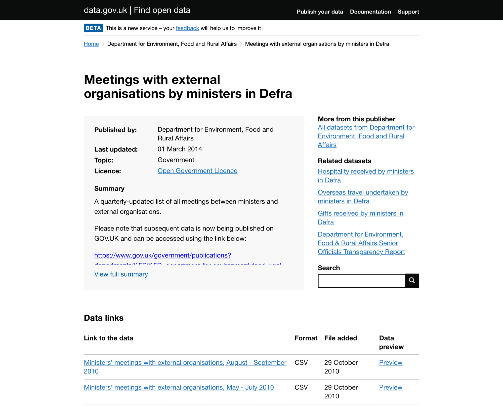
data.gov.uk was the UK's open-data directory, built and run by the Government Digital Service: a searchable catalogue of dataset records published by central government, local authorities and public bodies.
The National Data Library team took the service on with a broader ambition — to make it the home of UK public data rather than a catalogue of links to it. Two propositions carried that shift, and both were new to the service:
- Collections — curated, topic-led sets of high-quality data maintained by the team, instead of a directory that accumulated whatever publishers uploaded. Six topics at MVP: Business and economy, Environment, Government and Parliament, Land and property, People and Transport, alongside a rotating Spotlight.
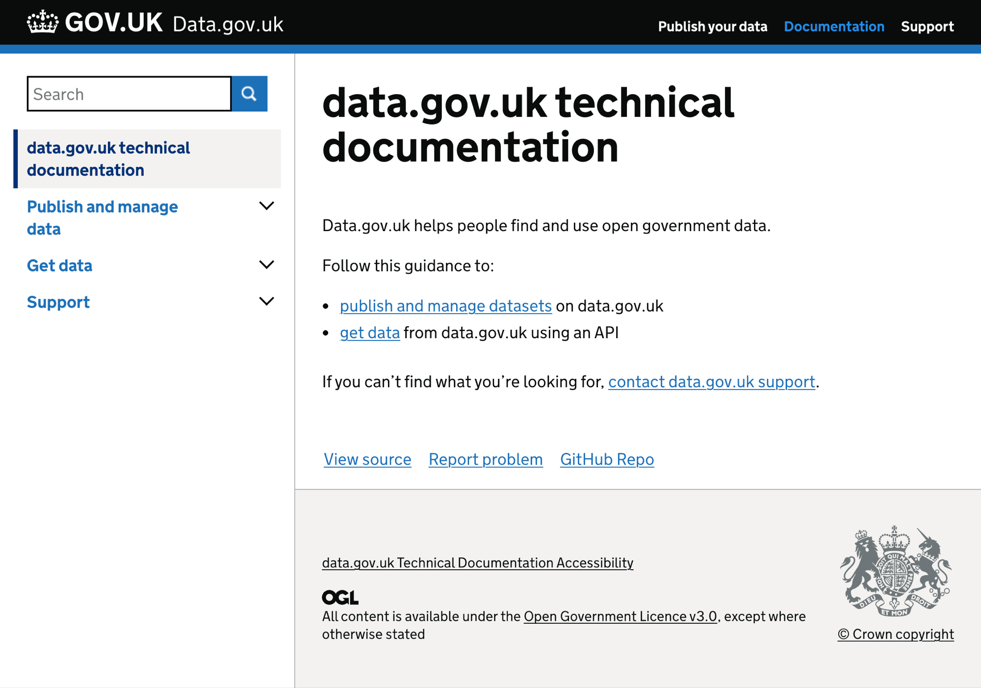
- The Data Manual — practical guidance on working with data in government, brought inside the service. On the legacy site, guidance sat on a separate subdomain, guidance.data.gov.uk, written as technical documentation aimed at publishers.
The legacy directory stayed, because established users still relied on it. So the MVP had to carry three propositions at once: two that were new and needed explaining, and one inherited that had to keep working.
Context and Challenge
data.gov.uk was being developed into a clearer gateway for discovering and using public-sector data.
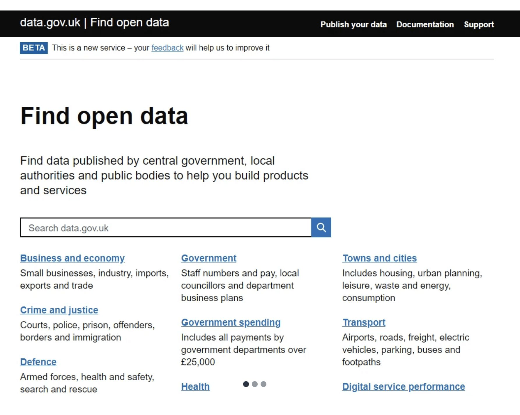
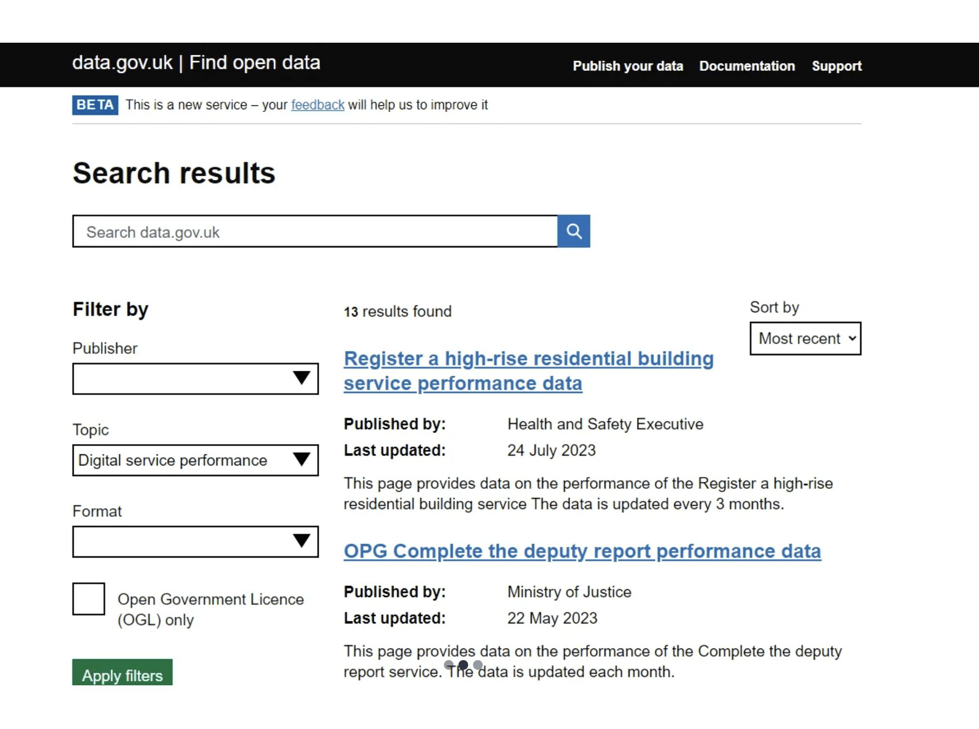
- The legacy service contained known usability and data-quality issues, including broken links, weak search experiences and unclear routes to guidance.
- Collections, the Data Manual and the existing dataset directory all had to be legible as distinct routes, without competing for the same attention.
The core design challenge was to create one coherent and accessible MVP across new and legacy routes, within tight delivery timescales and limited design-system capacity.
Problem statement
How might we create an accessible and coherent MVP across Collections, the Data Manual and the directory while working within delivery and design-system constraints?
What I Owned
I led interaction design across responsive MVP journeys, translating research into page structures and reusable patterns.
- Synthesised inherited and emerging research into design principles and interaction decisions.
- Designed responsive journeys for the landing page, Collections and the Data Manual.
- Facilitated alignment on service hierarchy and search priorities.
- Supported implementation through coded prototypes, build reviews and accessibility auditing.
- Contributed to the direction for scalable service patterns.
I worked with the lead designer, researchers, content specialists, product leads and engineers to balance user needs, accessibility requirements and delivery constraints. My responsibility was to balance these needs without treating stakeholder preference as a replacement for user evidence.
- What each group cared about
- Users: identify the most relevant route and understand how to access data or guidance.
- Product leadership: demonstrate a coherent and credible MVP direction.
- Research and content: ensure structures and terminology reflect evidence and user understanding.
- Engineering: receive implementable interaction patterns and clear responsive behaviour.
- Design leadership: establish an accessible direction that could scale beyond individual pages.
- Evidence behind the decisions
- Users needed clearer routes through data and guidance, from inherited research.
- Users needed help understanding and using public-sector data, from subsequent user research.
- Navigation and accessibility issues made the service harder to use, from the accessibility review.
Key Decisions
01 Distinct entry points
Create distinct entry points for Collections, the Data Manual and the directory, so each route is legible rather than competing.
02 Guidance inside the service
Position the Data Manual within the core service rather than as secondary support content.
03 One accessible pattern set
Apply consistent hierarchy, responsive navigation and accessible interaction patterns across the MVP.
I used these principles to evaluate design options and prevent individual preferences from driving the structure.
The constraint
Brand and Design-System Direction
The service needed a distinct identity, but the team did not have capacity to create and maintain an entirely bespoke design system.
- I reviewed the GOV.UK, ONS and MoJ design-system approaches.
- I organised a knowledge-sharing conversation with the ONS team.
- I compared the implications of bespoke patterns with building on established foundations.
- I recommended reusing proven foundations while introducing NDL-specific styling and components.
Tradeoff
This reduced visual and interaction freedom, but lowered implementation risk and supported faster, more consistent delivery.
I presented the recommendation to the lead designer and the wider team, and it shaped the direction we took.
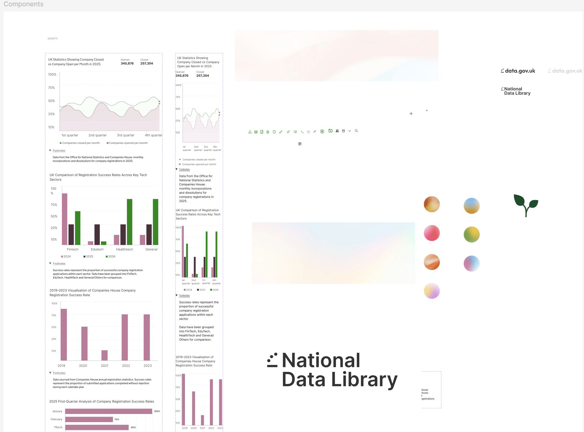
The emerging NDL pattern and style system
In implementation- Problem
- A distinct identity was needed without the capacity to maintain a bespoke design system.
- Decision
- Build NDL-specific styling and components on top of proven government foundations, rather than starting from nothing.
- Contribution
- Created the NDL components in Figma; recommended the underlying approach.
The MVP Journeys
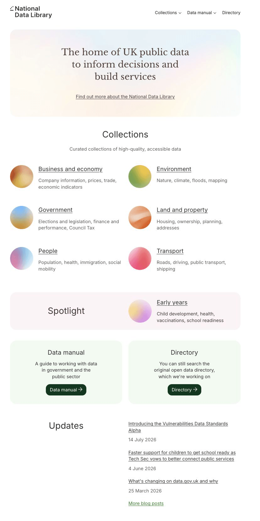
Landing page
In implementation- Problem
- The legacy service offered multiple competing routes with limited hierarchy.
- Decision
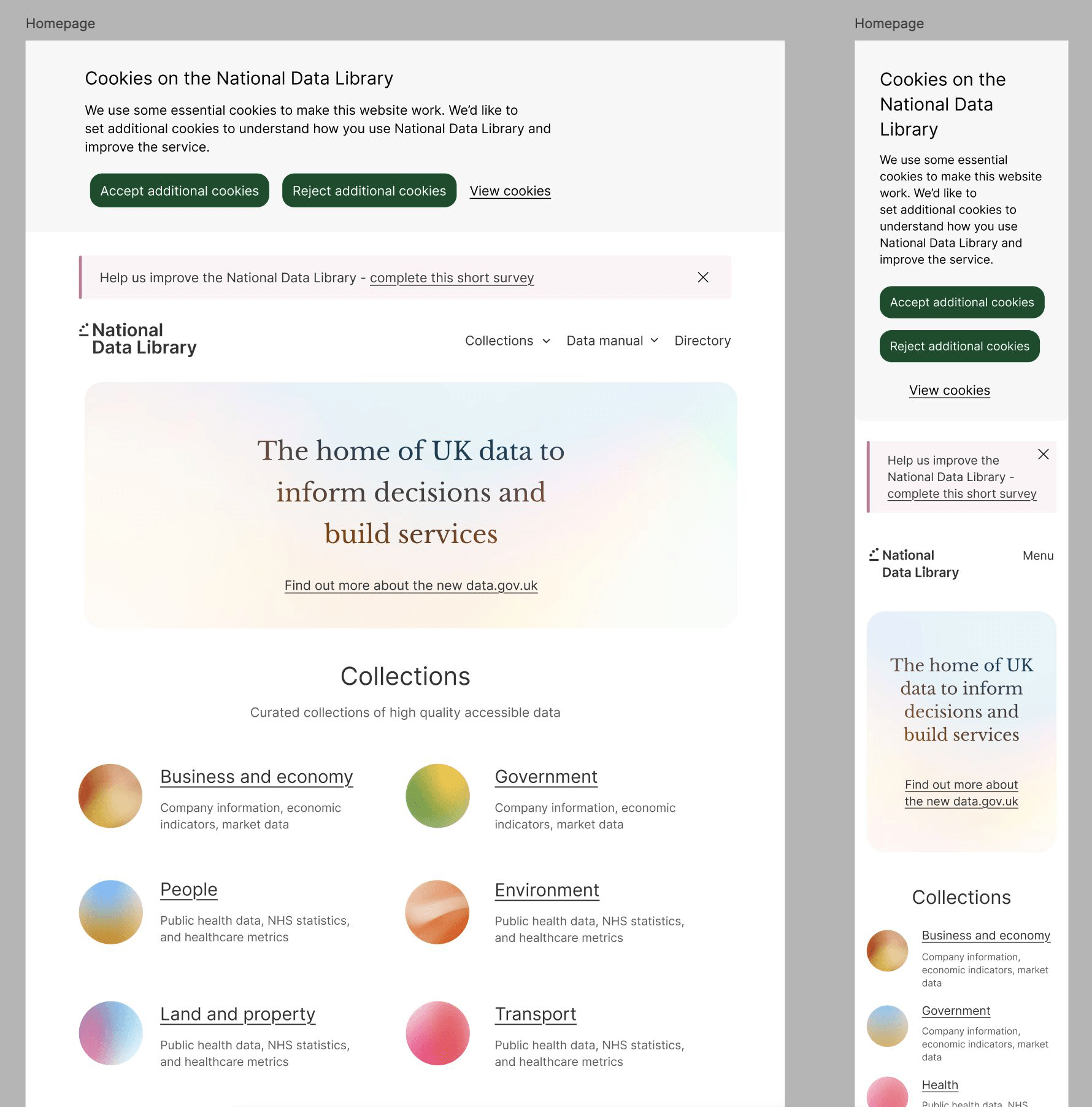
- Focus the landing page on a smaller number of prominent user routes, prioritising Collections and the Data Manual in the navigation while keeping the directory available for established discovery needs.
- Contribution
- Owned the page structure and responsive behaviour.
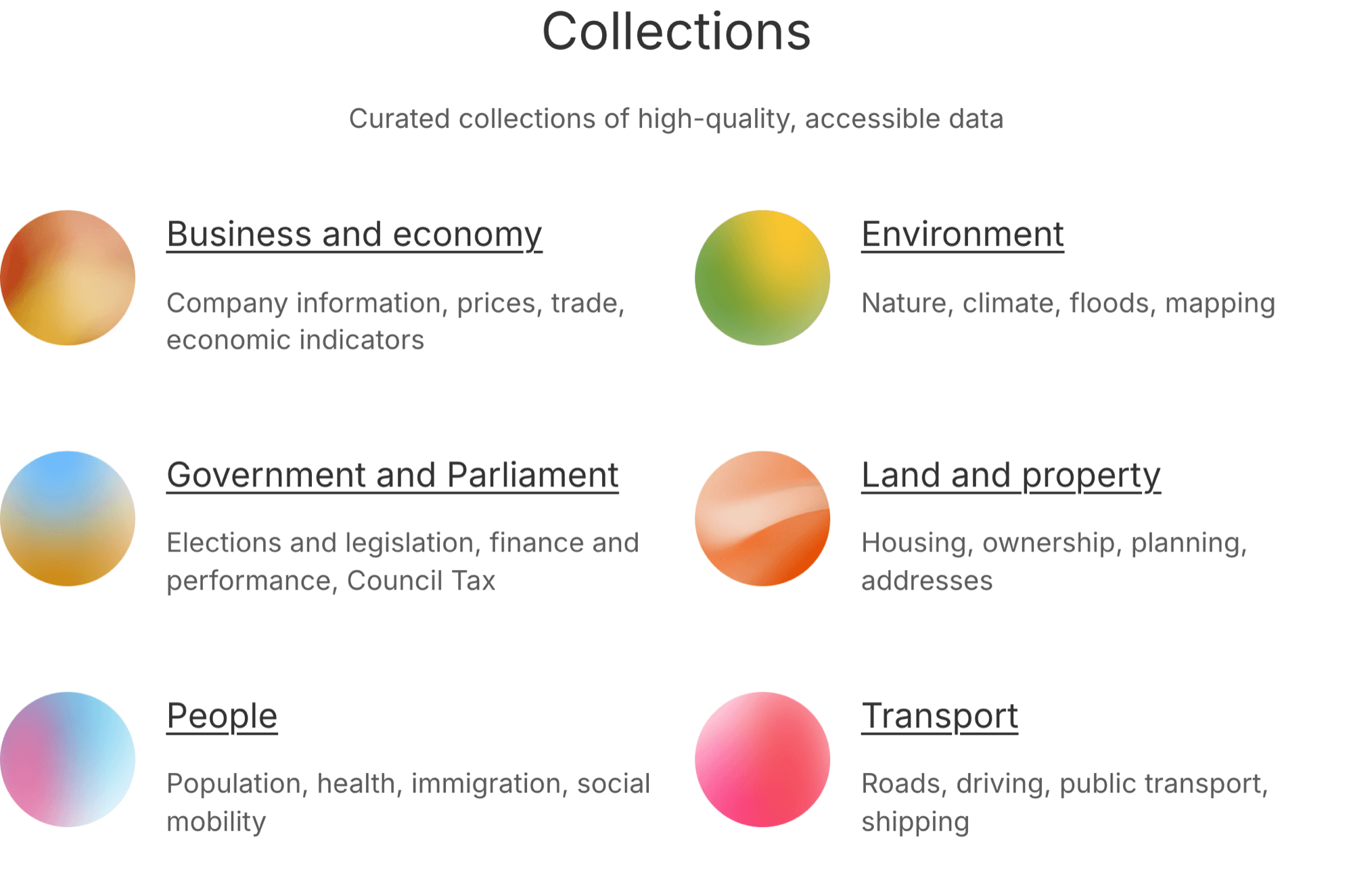
Collections
In implementation- Problem
- People needed to understand a topic and explore related datasets, not just retrieve a list.
- Decision
- Define a repeatable page model that accommodates different topics and content volumes, using visual topic markers alongside clear text labels so meaning never depends on imagery alone.
- Contribution
- Defined the page structure and responsive interaction behaviour; worked with product and content colleagues to clarify the proposition.
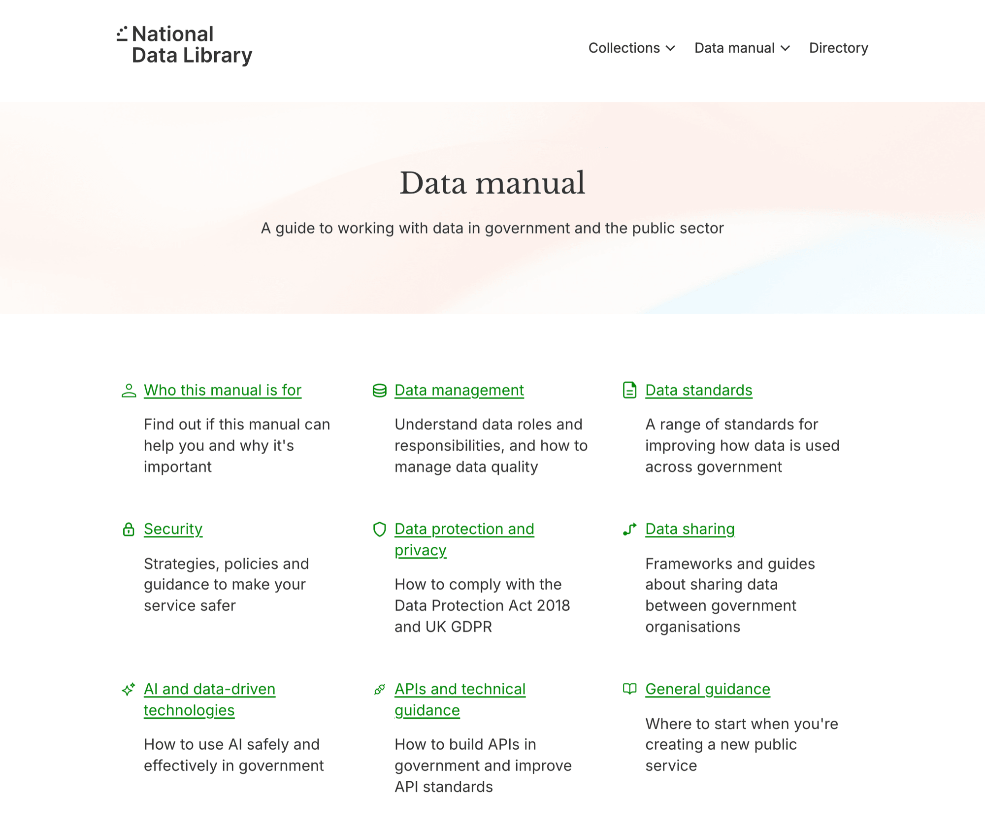
Data Manual
In implementation- Problem
- Guidance sat apart from the point where people discover and work with data.
- Decision
- Reuse the established page anatomy to reduce interaction inconsistency, while allowing each content type to keep its own purpose and structure.
- Contribution
- Created the responsive designs in Figma and built the corresponding journeys in the data.gov.uk prototype kit.
Responsive behaviour
In implementation- Problem
- Engineers needed clear responsive behaviour, not desktop screens to interpret.
- Decision
- Design the journeys at both widths and carry the same hierarchy across them.
- Contribution
- Owned the responsive journeys.
Embedding Accessibility into MVP Delivery
I partnered with the lead designer to assess core MVP pages against WCAG 2.2, document barriers and recommend remediation priorities.
- Reviewed representative journeys and components across the MVP.
- Recorded the affected criteria, user impact and recommended changes.
- Discussed findings with the team to distinguish immediate fixes from further work.
- Fed audit learning into page, component and content decisions.
The critical decision was not simply identifying failures, but agreeing what needed remediation before release and what required a documented follow-up plan.
The audit report itself is internal and is not reproduced here.
Aligning the Team Around Search Priorities
Stakeholders held different views about which information mattered most in search, and those assumptions did not always align with existing user-research findings.
- I designed and facilitated a prioritisation session across the multidisciplinary team.
- I made competing assumptions visible.
- I used voting to identify areas of agreement and disagreement.
- I reviewed the output against existing research before translating it into design decisions.
I treated the workshop as stakeholder-alignment evidence, not as a substitute for user research. The team separated a short-term visual-alignment release from the broader search improvements that needed more work.
Search, V1 and V2
Exploratory concept- Problem
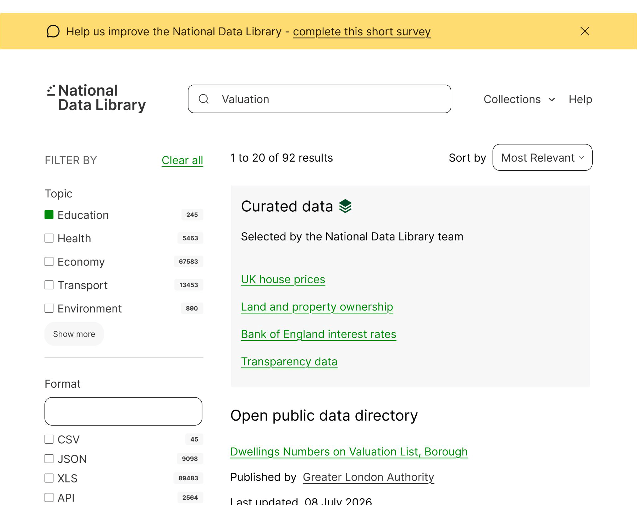
- Search sat outside the primary navigation, and directory results gave users little help judging relevance.
- Decision
- V1 aligned the experience with the new front-end style. V2 explored broader functionality: search in the primary navigation from user-research findings, curated data prioritised above directory results from the workshop and reviewed against research, and additional filters in response to research findings.
- Contribution
- Owned both design directions.
Working with Engineers Through Implementation
I created and refined coded prototypes in the data.gov.uk prototype kit, and used them to communicate interaction behaviour beyond static Figma screens.
- Discussed feasibility and responsive behaviour with engineers.
- Refined specifications when implementation exposed gaps or constraints.
- Reviewed built components and gave feedback on behaviour, hierarchy, responsiveness and consistency.
The prototype-kit repository is private, so it is not shown here.
Outcomes
What we delivered
- Responsive MVP designs for the landing page, Collections and the Data Manual.
- Reusable interaction patterns and coded prototypes supporting implementation.
- WCAG 2.2 audit findings and recommended remediation actions.
What I influenced
- A direction based on proven government design-system foundations.
- Shared prioritisation of search information and future improvements.
- Closer design-engineering collaboration through the prototype kit and build reviews.
Reflection
With more time, I would have tested the brand and emerging service proposition with a broader range of users before consolidating the visual direction.
Related work
Selected work
Designing Trust into AI-Connected Commerce
Research and prototype work for ThriveCart MCP, focused on onboarding, permissions, privacy, trust, and AI product value.
Read case studySelected work
Scaling a Complex SaaS Reskin with AI-Assisted Design Systems
Component alignment, responsive coverage, implementation review, and the connection between Figma, Storybook, the UI package, and the live product.
Read case study