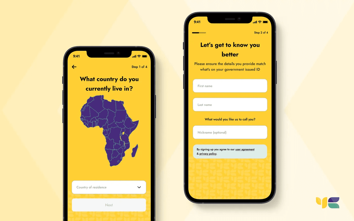
Onboarding Redesign
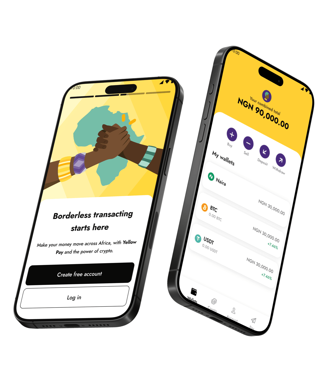
In short
- Problem
- Account creation ran to 24 steps with notable abandonment, verification sat apart from signup, and requirements differed by market.
- My role
- I led the onboarding design workstream within a wider design team, across native app and web.
- Key decision
- One clear action per screen, verification folded into onboarding, and expectations set before document upload.
- Outcome
- The journey went from 24 steps to 13, with responsive patterns across the markets in scope and verification adapted to each market's constraints.
OVERVIEW
Yellow Card is the largest and first licensed stable coin on/off ramp in Africa. The company provides secure and cost-effective methods to buy and sell USDT, USDC, and PYUSD via your local currency directly across 18+ countries.
I joined the company in 2022 as the Lead Onboarding product designer, just as it was preparing to rebrand. I redesigned the onboarding flow, a key initiative that contributed to reaching one million active users within six months and helped the company successfully expand into five new markets.
My Role & Ownership
I led onboarding design end-to-end, owning research, interaction design, usability testing, and stakeholder alignment across product, compliance, and engineering teams.
The Problem
I joined in 2022 at a pivotal moment: the company was preparing to secure Series B funding and rebranding to bring consistency to its operations across more than 18 countries. The account-creation journey contained 24 steps, with notable abandonment at points in the journey, and identity verification sat apart from account creation. Requirements differed by market, including regulation, accepted identity documents and network availability.
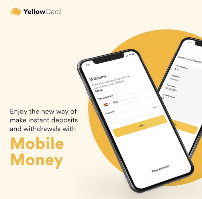
User Research
I carried out an in-depth audit of both the mobile and web applications to uncover current customer challenges. This involved analysing data on Mixpanel with support from the company's data analyst.
- Pinpointing major drop-off points within the user flow
- Conducting customer interviews to gain insight into pain points encountered during the signup process
- Identifying daily tasks that users need to complete
- Defining metrics to measure the success of these tasks
Qualitative Interviews
Yellow Card operates in over 18 countries, which makes in-person customer interviews challenging to run across every region. To address this, I identified our top five markets and conducted virtual interviews via Zoom. I also used Maze to track user interactions and capture their reactions while they engaged with the previous app version. Key customer pain points identified include:
Overwhelmed Olivia: Olivia found the signup process lengthy and confusing, leading to a high drop-off rate during onboarding.
Lost Liam: Liam reported difficulty in navigating the app, with several users struggling to locate essential onboarding features quickly.
Frustrated Bliss: Bliss expressed frustration with the limited support resources within the app, making it challenging to resolve issues promptly when signing up on both mobile & web.
Insights
After many user interviews, contextual inquiry and analysis of the data, I grouped the insights into three categories.
Customers find it overwhelming and time-consuming.
Navigation and country selection was difficult for many users.
Customers feel the app's interface looks outdated, impacting trust and engagement with the platform.
Customers find it challenging to verify themselves after creating an account.
We saw a significant drop-off rate on the “Welcome Back” screen, which is a key contributor to overall user drop-offs as highlighted in our Mixpanel data.
Customers prefer a more region-specific onboarding experience tailored to their local context and needs.
Customers experience repeated difficulties with ID verification, causing delays and frustration.
User Profile
The research showed that people approach the app with different needs and usage patterns. I built three distinct user profiles around their goals, tasks and location, drawn from active customers working through tasks on the old screens, and presented them to stakeholders.
Name: Overwhelmed Olivia (interacting with the product for the first time)
Speaks English | Bachelor's in Commerce & LLB | Age: 27 | Location: South Africa
Tasks performed:
- Signup on the Yellow Card mobile application using her phone number
- Receive OTP via SMS
- Identity verification using any means of identification
Name: Lost Liam (Active mobile user)
Speaks English | Trader | Age: 23 | Location: Nigeria
Tasks performed:
- Signup on the Yellow Card mobile application using his phone number
- Receive OTP via SMS
- Identity verification using any means of identification
Name: Frustrated Bliss (Active web user)
Speaks English | Trader | Age: 35 | Location: South Africa
Tasks performed:
- Signup on the Yellow Card web application
- Receive OTP via SMS
- Identity verification using any means of identification
Conceptualisation
I started with the information architecture and user-flow concepts for the primary use cases. Once the Product Manager, developers and stakeholders signed off on the mockups, I mapped a new user flow for the new direction, shared it with the other designers for input, and revised it until it was approved. With confidence in the design, we moved to high fidelity.







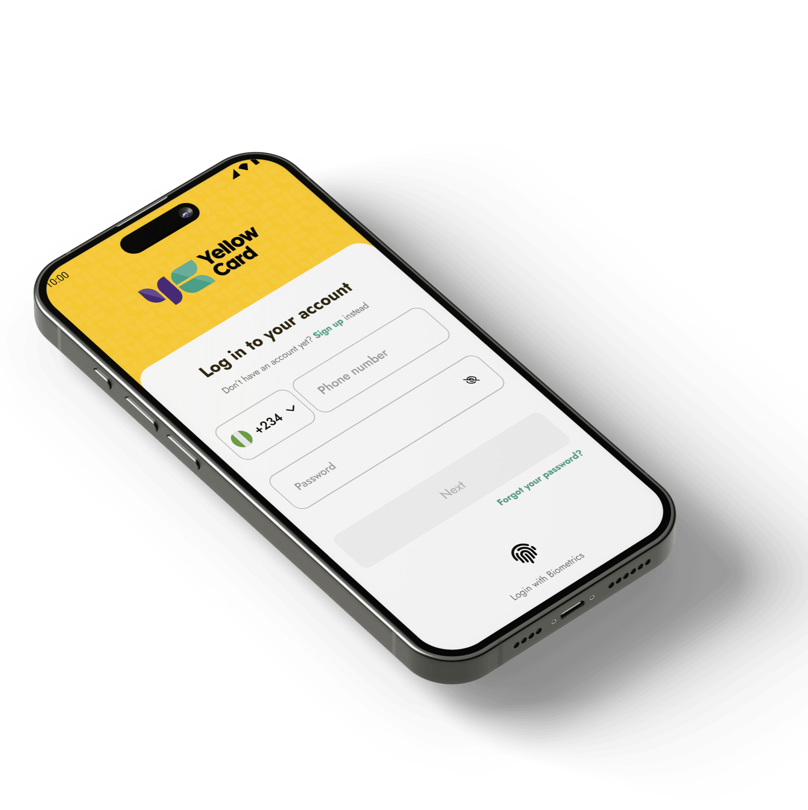
What I Shipped
The new design direction was guided by Yellow Card's refreshed brand identity, aiming to convey the company's core values more clearly. This redesign also integrated extensive feedback gathered during research, resulting in a user-centred experience that enhances usability and engagement.
- Mobile and web onboarding flows
- High-fidelity, developer-ready prototypes
- Reusable onboarding components aligned with the refreshed brand
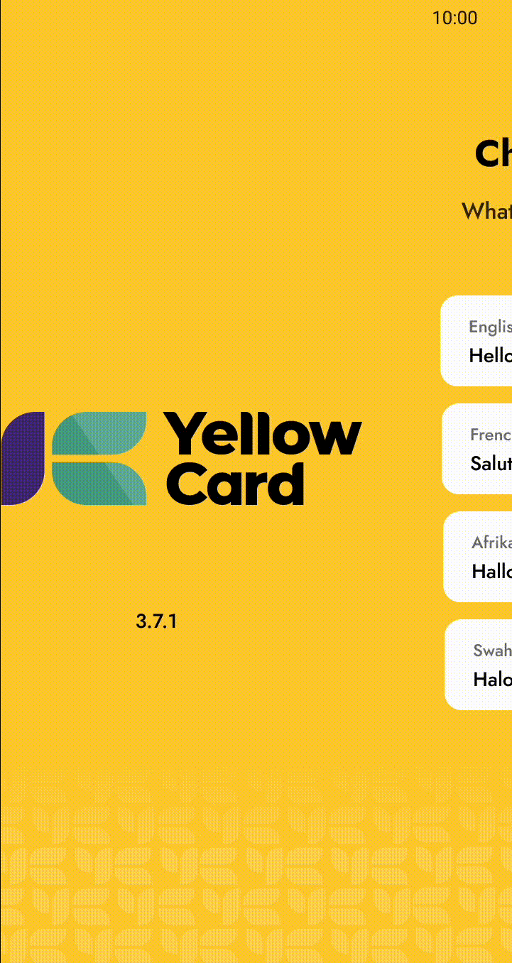
Mobile Signup flow
An overview of the high-fidelity mobile sign-up designs, which went to the design team and were approved for usability testing ahead of launch.
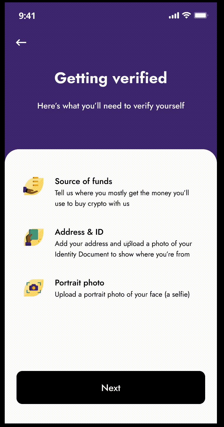
Mobile verification flow
An overview of the high-fidelity mobile verification designs, approved for usability testing on the same round.
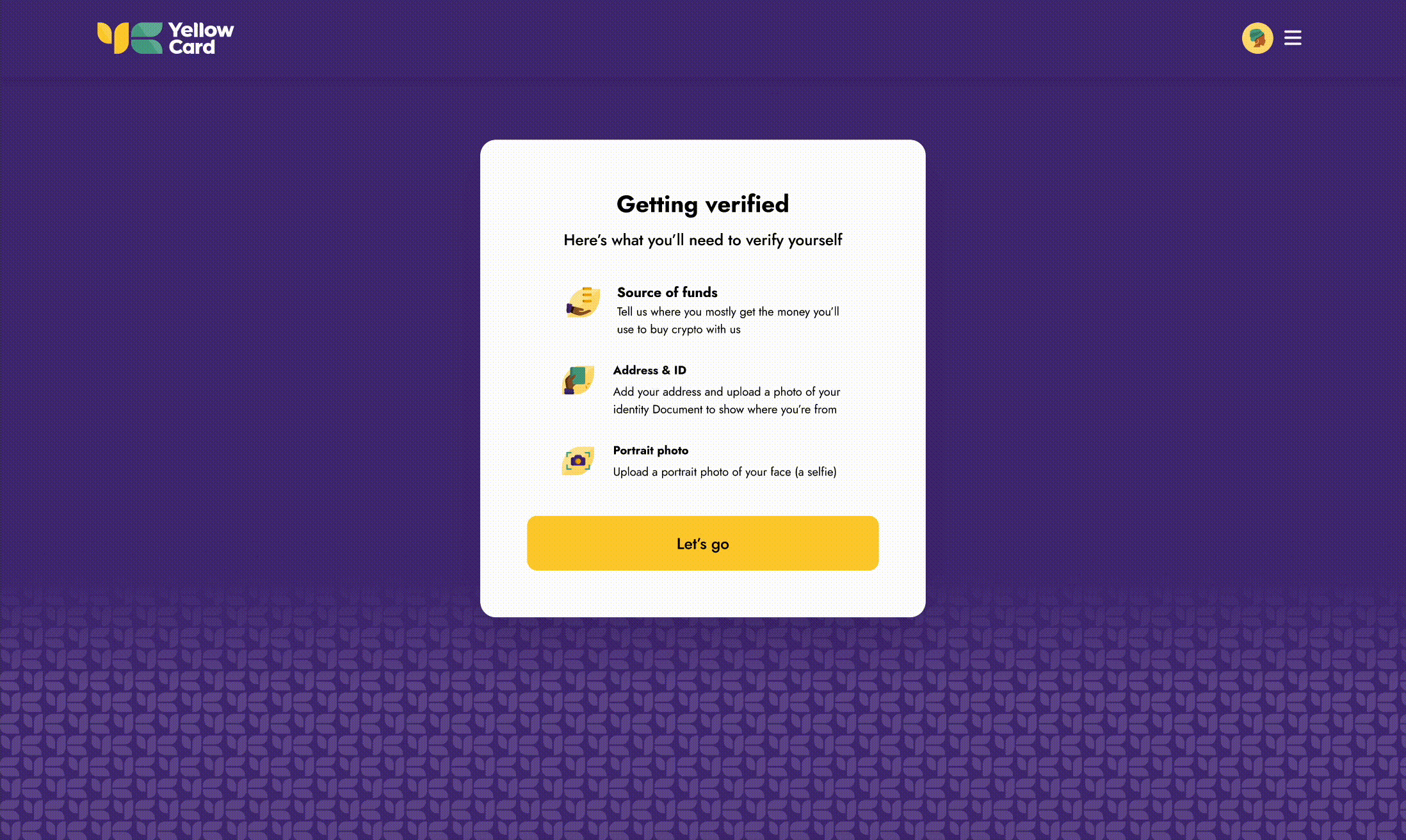
Web Onboarding flow
An overview of the high-fidelity web designs, approved for testing ahead of launch.
Usability Testing
I ran usability testing sessions with customers in several countries, talking with them and observing how they moved through the new design.
That surfaced several pain points, which I used to improve the flow.
Here are some of my observations:
- Customers preferred localised flow in their language
- Customers want to verify their phone number using WhatsApp instead of only SMS
- Customers want to know what they need to have before starting their onboarding process
Signup flow (After testing)
I applied the feedback from usability testing to improve the flow, and it launched in 2022.
Seeing Results
After the beta testing phase, we launched the mobile and web apps across 18 countries and closely monitored usage over time. I also held several meetings with the sales team, who regularly interact with customers, to gather feedback and gauge acceptance of the new direction.
24 to 13 steps
I reduced the account-creation journey from 24 steps to 13.
Native app and web
Responsive onboarding patterns across the operating markets in scope.
Verification integrated
Identity-verification preparation brought into the onboarding flow rather than left as a separate journey.
Wider business context
The redesigned onboarding formed part of the product experience during a period when the organisation reached one million active users, entered additional markets and completed a funding round.
Those are company outcomes the work contributed to, not results the onboarding redesign can claim on its own.
How the Verification Approach Evolved
The interaction challenge was to offer alternatives without making a security-sensitive journey confusing or inconsistent.
| Version | Evidence or constraint, and the decision |
|---|---|
| V1 | Existing SMS verification journey. Establish the redesigned baseline. |
| V2 | Testing exposed delivery and network constraints. Explore a relevant alternative channel, introducing USSD in relevant markets. |
| V3 | Cost, technical and market considerations. Add WhatsApp OTP where appropriate. |
Project Learnings
1. User Testing is Non-Negotiable
As a designer, it's tempting to focus on visually stunning, trendy, or unconventional designs. But throughout this project, I learned that user testing is crucial. The primary goal is to stay focused on understanding the user, their pain points, and crafting solutions that directly address these. By grounding the design process in user testing, I was able to ensure that each iteration stayed aligned with the users' actual needs.
2. Strategic Stakeholder Management
A key takeaway was the importance of setting a clear roadmap for an MVP. This approach helped manage stakeholder expectations and keep out-of-scope requests at bay, which could have otherwise diverted resources and time. With a well-structured plan in place, I was able to keep the project on track and deliver a high-quality product that met deadlines.
3. Embrace Early and Continuous Feedback
One valuable insight I gained was the importance of actively seeking feedback at every stage. As the saying goes, “It's better to be saved by constructive criticism than ruined by praise.” By keeping stakeholders and users in the loop and testing concepts whether as sketches, low-fidelity, or high-fidelity prototypes I was able to validate ideas early on. This not only streamlined the design process but also saved substantial time that might have otherwise been spent on extensive revisions.